I decided to redo my baseball uniform concepts with new templates. A couple of notes:
1. Reduced the alternate designs to one per team, which they could wear for a limited number of preset home games, be it weekday afternoon games, or a specific day of the week, etc. Also including a batting practice / spring training top for each team.
2. No numbers on the front (again for the most part), they always look asymmetrical and clunky, plus they weren't even used until the 1950s.
3. The MLB has said expansion is likely to happen soon once the A's and Rays stadium situations are settled, there are a handful of choices to put teams in a reasonable alignment, Nashville and Portland seem like strong front runners. This puts another team in the Pacific time zone for the AL West, as well as another team in the south, and would require just swapping a couple of teams between AL and NL for a good alignment of 4 divisions with 4 teams in each league. 16 teams in each league will also allow both to remain separate, getting rid of interleague play which makes the all star game special again.
AL East:
Baltimore Orioles - Not really drawing from any one particular era here, home script and socks from the 1950's, modern away script, and a completely new orange hat design with a B. The alternate O's vest, with multi panel bird head cap is a nod to their design that showed up in the late 1970's.

Boston Red Sox - They are the Red Sox, so I just emphasized red in the uniform. They really should wear that red cap from the mid-1970's as their primary design. For the alternate it is their navy cap and a cream uniform with their original Red Sox block font.

New York Yankees - Obviously no changes here to this classic, and also no alternate uniform.

Washington Nationals - Washington's past franchises were in the AL, and they have an obvious local rivalry with Baltimore to make this move work. I decided to go with a dark blue (but not navy) as the primary. Added new primary and secondary logos that are much less generic than their existing ones, based on the old Senators, and likewise dumping the script W on the cap and going with a similar design to their alternate cap. Jersey font is based on Washington's early 1960's road font. I kept the home and road simple, blue numbers and letters, with red piping and NOB. For the alternate I went with a DC logo based on their blue pinstripe design of the 1950's.

AL North:
Chicago White Sox - I don't love their current design but they've had it for over 30 years now and it also existed in other periods in their history, so they seem to own the simple black and white look. I did replace SOX on the cap with similar style C. The alternate look is based on their 1942 script and cap.

Cleveland Guardians- Can't say I really like the new name, feels like they chose Guardians because it sounds like Indians. With the rebrand I don't know why they didn't change up the colors, navy and red are overused in baseball, a darker, almost maroon red and a lighter blue would be something different, and they smartly featured them in some of the city connect design. I'm using the darker red and lighter blue as the main colors, with a little navy mixed in. The Cleveland wordmark is good, the Guardians one less so, so I redid the Guardians wordmark in the Cleveland style. The winged G logo feels more like a secondary mark. For the primary logo I did some slight modifications to the CC logo which is one of the best things to come from that entire, mostly awful, program. The alternate uses the script wordmark, and ditching the light blue makes this one feel more in line with their past as the Indians.

Detroit Tigers - The Tigers have a nice and simple old school look, though I added orange trim to the D on the chest and numbers on the home jersey, also reverting the different style D on the hat and jersey. I prefer the older version of the script on the away jersey that they used from the 1930's through the 1950's. Their alternate design is based on the one-off 1928 Tigers design.

Toronto Blue Jays - Their current set is pretty good, though instead of navy and royal blue went back to royal blue and light blue, plus added their T on the cap instead of the bird logo. I like the idea of one team being unique and using baby blue instead of gray on the road. In my mind the teams I most associated with the baby blues were the Phillies, Royals, and Blue Jays, and since the Jays still have light blue in their colors, they make the most sense to keep it. For the alternate it is their multi panel bird logo cap along with some thick stripes on the uniform reminiscent of styles when the team was founded in the late 1970s.

AL Central:
Arlington Rangers - I'm not a fan of using state names when there are other teams in the same state. I like the idea of using their actual home off Arlington, instead of Dallas, as it has an old fashioned feel to use the lesser known city they are actually playing in rather than the large city of the region. I switched their primary color to red to change it up a bit, from all the other blue and red teams. Went back to modified versions of their earlier logos, which are a little more unique, and the jersey script and cap font from the 1980's. For their alternate, as a nod to their history, the original 197 wordmark, and a new R alternate cap logo.

Colorado Rockies - Cutting the NL West down to four teams, one had to move to the AL, and Colorado made the most sense geographically to match up with the rest of the AL Central teams. I promoted the purple making black the obvious secondary color, simplified their font, and dumped the silver. The alternate look felt like a similar concept to the Cards having a full logo, that includes the name, which seemed to work with the Rockies' mountain logo.

Kansas City Royals - They have an under rated classic uniform if they keep the away script design preferably the version from 2006. Just created a new secondary logo. The alternate using the KC with the crown over it on a vest (a nod to the Athletics time in KC) with gold accents throughout the uniform.

Minnesota Twins - The Twins had another simple and good look prior to the 2023 redesign. Going back to the old look, just changed up the twins shaking hands logo to the primary, and put the TC letter mark into their roundel as secondary logo. The pinstripes on the road grays are unique touch. Grew up with the Minnesota M on the cap rather than the Twin Cities' TC, so I went with the M and kept the TC as a sleeve patch. Going with cream also gives them a pastoral look fitting for one of the AL's original teams. The alternate uses pinstripes, and the TC logo, just using the modern Twins logo for the patch.

AL West:
Anaheim Angels – Going back to calling them by their correct name. Their city connect script is great, so making that their full time design. Added a little more yellow into their design to change them up from other red and navy teams. I don't love the red A on the red cap, but it has become their look the last several years, and it distinguishes them from other red and navy teams out there. Also bringing back the updated versions of old logos; an updated baseball diamond with wings logo, and California with the halo logo. For an alternate, bringing back a navy cap had to be a part of it, the thick stripes as a faux back type look to the 70's with the wordmark from that era.

Las Vegas Athletics - Unfortunate they didn't make it work in Oakland, but on the move again to Las Vegas, I'll skip the transition Sacramento period. I am keeping their classic color scheme, with just some slight changes to the classic uniforms and logos, including the Las Vegas star within the roundel design, which also ended up looking a bit like a casino chip. Only using with one version of the signature A throughout the uniform, the A from the logo, rather than a slightly different one on the cap. Their alternate uniform is based around the 1970's vest design.

Portland Pioneers: A Portland/Seattle rivalry would be good for baseball. The Pioneers name being an obvious nod to settlers using the Oregon Trail, and logos featuring a frontier buffalo and recolored city flag. Black with bright and light red that would match with the Rose City nickname, and also sync up with Blazers in town. The P cap logo based around the hypocycloid star from the flag. The jersey design is fairly conventional with a block font and some rose trim.

Seattle Mariners - This design is a combo of various eras. Color wise ditching silver and making the teal a little more seafoam greenish. Keeping the primary logo but going trident M from the early 1980's as an alternate logo. The jersey fonts are also from their early years, and the cap logo being a modified S from the city flag. The alternate design is a cream set with the trident/star logo, and a trident M cap logo.

NL East:
Cincinnati Reds - Good uniforms and logo, just changing up the drop shadow black for simple outlines. Also putting Mr. Redlegs on the jersey sleeve. They get to keep the front numbers as they are a nice balance to the logo on the front. Alternate design being a vest with the Reds script font, and white cap reminiscent of their early days more than a century ago.

New York Mets - While they have tweaked things here and there the last few decades, this is pretty much the 1997 design, but in cream and with Mr. Met as a sleeve patch rather than the primary logo. Never liked the pinstripes for the Mets, seemed to derivative of the cross town rivals who obviously are most associated with them, so it may be sacrilege to Mets fans to drop those. But I am using a design based around the 1986 championship season uniform for the alternates, just dropping the front numbers and going with an orange brim hat.

Philadelphia Phillies - A modern classic, no need for changes. Just retaining the bell in diamond logo rather than the current diamondless version. Also keeping the sleeve numbers that were recently dropped to make room for ads. The cream alternate also stays as a great look.

Pittsburgh Pirates - Again, another good, classic look. The only changes here are dumping the red accents and just keeping it simple with black and yellow. Also changing up the sleeve patch to the flag secondary logo. For the alternate just using the similar design but as a pinstripe vest.

NL South:
Atlanta Braves - The uniforms work for the most part, just a little adjustment to make the piping simpler, I always thought that was excessive. Their alternates being the home version of the mid 1970's design, but color swapped to navy instead of royal blue.

Miami Marlins - This is a team that got it right the first time. They had an existing M-fish logo they could have just switched to when they changed the name from Florida to Miami. Going back to something very similar to the original teal pinstripe look, but making M-fish a secondary logo, and a plain M as the cap logo. Ditching silver and featuring a coral-ish orange a bit more. The alternate look being black and featuring M-fish logo.

Nashville Sounds - I do like a lot about their existing minor league team design, but given the abundance of navy and red teams already, it needs to be recolored: black with bright blue and some yellow trim. Adding in the guitar pick and Tennessee star pattern to the logo. I wanted the uniform itself to be as simple as possible, and bringing back the wordmarks from their 2015-2018 set, that had a great musical motif to them. Taking aspects from various parts of their history to make something new. The alternate uses Music City wordmark rather than Sounds.

Tampa Bay Rays - Realigning the divisions, Tampa just makes more sense with the handful of other southern teams. The original gradient logos were too much, but if you take their second green and blue color scheme and apply it to the original logos and design it works great. Not much green in baseball, and green and blue have always been a favorite color combo of mine. The gradient does work as an alternate design, heavy on the blue.

Central Division:
Chicago Cubs - Not many changes here, ditching the sleeve patch on the home jersey, with the left chest logo it made the jersey a bit too unbalanced. I also changed up the away jersey font to the 1927 design and blue numbers also. Their alternate is based on their 1914 set.

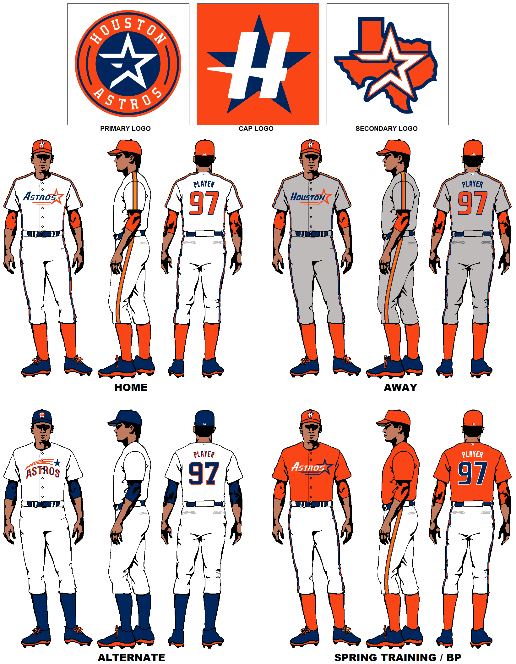
Houston Astros - Moving them back to the NL, they always felt weird as an AL team. Their 1994 design feels modern and space-age fitting with their name. Keeping the star logo on the wordmark in this design, which feels like a natural evolution from their original shooting star design. The thicker shoulder and pant stripes also create a retro-futurist feel, and maintain their rainbow orange history. The alternate is a throwback to the original shooting star design.
Milwaukee Brewers - I thought about the old MB ball and glove logo, but I never was a big fan of it, for years it just looked like a glove and not MB, so growing up I always thought it was the worst cap because it just had a baseball glove on it. Instead I went with the cap design from the Milwaukee Braves days, just swapping out the red brim for yellow. The 1990 script fonts are much sharper than the new ones, and look good on a plain jersey. Also a new logo based on a fan design contest they did a few years back, as well as a combo MB glove on the state of Wisconsin. The alternate set uses their inaugural season in Milwaukee road font, with some thicker stripes, and the MB on a multi panel cap,

St Louis Cardinals - Really nothing to change with the Cardinals, just a great look. The only thing I would change is to have the city name on the away jersey and make the home an old fashioned cream. For alternate going with a modernization the 1956 design that had a simple script rather than the traditional bird-on-bat crest

NL West:
Arizona Diamondbacks - I think their red/gold/black color set looks good and feels very Arizona. They finally got around to creating a full Diamondbacks wordmark, so that goes on the home whites rather than the awful D-Backs moniker. The alternate design is based partially off their original look that featured a pinstriped cream set, but using a snake-D on the chest rather than the A logo.

Los Angeles Dodgers - Nothing to change up here really. Just pulled the LA sleeve patch which is repetitive. For the alternate, going way back to an LA version of 1933 Brooklyn Dodgers' set.

San Diego Padres - Glad they went back to the original brown and yellow. Using the current jersey font and numbers, and the 1998 friar as the primary. Also going with the light brown instead of gray for the road uniform. I think the use of brown makes the standout enough to not need any trim or other frills on the main uniforms. For the alternate, design elements from their pinstripe set of the 1980's.

San Francisco Giants - Going with the 2000 design sans gold, but switching up the number font, and a new secondary logo as the sleeve patch. The alternate design a white uniform with the script wordmark they used in the late 1970's including era appropriate pant and sleeve stripes.

This comment has been removed by a blog administrator.
ReplyDeleteHi, hehe They look cool but only one seems for me to be so funny... the Boston Red Sox don;t you think placing the sox on a ball it wasn't a good idea? The seams on the ball look like the sox smell :P if You now what I mean :) Great post You put so much work in it, thanks for posting, cheers. Guy from Bookmakers bet
ReplyDeleteNice work overall!
ReplyDeleteBig NO to the Tigers home jersey. That's as timeless as the other ones you left alone.
Not crazy about the number font for the Giants and Astros reverting to MLB Generic.
I would not be so dogmatic about the "home city initial on caps only" rule. While it eliminates the mistake Arizona is making currently, it eliminates timeless designs from the White Sox, Blue Jays and Orioles. With Colorado, Cleveland, Cincinnati, Charlotte and the Cubs, does your league really need another stylized C for the Sox?
Thanks. Totally understand on Detroit. They are timeless, I'm just not a fan of the D on the chest. I did some research on the Sox, surprisingly they used a stylized C pretty frequently throughout their history, their current look is just classy that you'd think they've been using it forever. But I'm just a big fan of the teams being heavily associated with their city/region, that's why I go letter logo on the cap.
DeleteNice work, but I disagree with taking away the bridge from the Mets' logo.
ReplyDeleteAfter all, the AL has two "Sox/sock" teams and it's not like people get them confused.
In addition, Citi Field has the "Shea bridge" as a prominent part of it's theming. And I'm pretty sure there are more bridges in New York than in the bay area.
Just my two cents worth.
Thanks, very true. It does like sort of empty without the bridge. I had always thought they should try to incorporate the Statue of Liberty in there somehow.
DeleteToo much gold on the Pirates logo. Looks like jaundice.
ReplyDeleteI've tried writing a long and civil explanation,but it keeps kicking me off. I loved all these, but Dallas Rangers is like spitting in the eye of Tarrant County where they play. Dallas fans only show up when they are good. Please fix this. Arlington and Fort Worth thank you. I can't emphasize enough how offensive Dallas Rangers is.
ReplyDeleteI've tried writing a long and civil explanation,but it keeps kicking me off. I loved all these, but Dallas Rangers is like spitting in the eye of Tarrant County where they play. Dallas fans only show up when they are good. Please fix this. Arlington and Fort Worth thank you. I can't emphasize enough how offensive Dallas Rangers is.
ReplyDeleteI've tried writing a long and civil explanation,but it keeps kicking me off. I loved all these, but Dallas Rangers is like spitting in the eye of Tarrant County where they play. Dallas fans only show up when they are good. Please fix this. Arlington and Fort Worth thank you. I can't emphasize enough how offensive Dallas Rangers is.
ReplyDeleteWell if you are actually offended by a uniform design I'm not sure what to say. But after looking into a bit it seems the consensus is their fan base is less in Dallas and more so in the rest of the metroplex. I'll switch it up to Arlington.
DeleteThese are great. The Padres and Brewers changes need to happen ASAP.
ReplyDeleteThanks. I do love the old school brown Padres as well.
DeleteHey great work, very interesting. Some I love, some not as much lol.
ReplyDeleteI was wanting to know how you did this, I've always wanted create my own version for NBA, MLB, NFL and more. Just curious if you used a certain program with the templets or what. Thanks
Thanks. Actually I mainly used MS Paint. Also a really old program that came with a scanner I bought in the 90s called iPhoto express, mainly for typeface stuff and resizing of graphics. To create the templates I simply uses existing uniform graphics on the internet and saved them as a 16 color image in paint, that simplified the images such that they could be basic templates and easy to work with using the primative tools in paint. Likewise I did the same with various graphics I found online. It should be pretty easy to save my images and convert them over to templates for you to play around with.
DeleteDid you recently make some additions to this project? I don't recall seeing the Crabbers, Diablos, Sounds or Mounties when I last viewed this page. Also, it appears you swapped color schemes for the Knights and Stingers. Not sure I like this change. Gold seems like a more appropriate color choice for a team called the "Knights" than green. I do, however, like the new color scheme for the Pioneers.
ReplyDeleteYes, added some new ones in there. I switched up the Knights and Stingers mainly because when adding teams and realigning the leagues it seemed repetitive to have black/gold Knights with black/yellow Pirates. I think you are right that they do look better with the gold. Thanks for the feedback.
DeleteFor the jerseys it is (for the most part) the city name on the away jersey and the nickname on the home jersey. Also no numbers on the front ... bjerseys.blogspot.com
ReplyDeleteDid you recently update the Knights logo?
ReplyDeleteP.S. I'd love to see your take on a New Orleans and Las Vegas team!
Thanks, yes I did update the Knights logo. I'll get working on some ideas for New Orleans and Las Vegas. I've done San Juan, Mexico City, Vancouver, San Antonio, Indianapolis, Portland, and an updated Montreal Expos. Vegas and NOLA would be fun to try.
DeleteThis comment has been removed by the author.
ReplyDeleteLOVE the Whalers and Zephyrs designs! Would still like to see something Vegas-themed. Great update!
ReplyDeleteJust out of curiosity, where did you find those wordmarks for the Vancouver Mounties?
ReplyDeleteThe Mounties wordmark I modeled off of an old jersey I found an image of on internet. I think I just found I a font I liked for the Vancouver wordmark.
DeleteDo you remember which font you used for the "Mounties" wordmark?
ReplyDeleteThis comment has been removed by the author.
ReplyDeleteThis comment has been removed by the author.
ReplyDeleteI just stumbled onto this while looking for a font close to the block font for the Nationals. I really am trying to get N, A, T, O, M, A, S in the font that your using for the Primary and Home jersey's Nationals. Any suggestions?
ReplyDeleteNot sure the name of the font, but if you go to sportslogos.net you can find the graphics for both "Nationals" and "Washington" wordmarks using that font, and go from there to edit and create what you are looking for. That would have all the letters you are looking for, (if you flip the W in Washington to make an M).
DeleteHi, saw this in 2916 and there were 40 teams! They were great and I was wondering if you could post them again.
Delete2016
Deletecan someone please help me with this?
ReplyDeleteWas actually just updating some of the other teams. All 40 are up now.
DeleteNeat! Thanks. Sorry to ask another question but some other commenters have talked about a Hartford Whalers baseball concept in here. Was this updated?
DeleteNice to see all the expansion teams back. The Outlaws turned out great! Thanks for taking my request. I think I prefer the "Zephyrs" identity to the Pelicans for New Orleans, but this still looks good. I think you finally found the perfect look for Charlotte--their old logos and wordmarks with their modern black and gold. One small suggestion: I'd make the crown of the Sounds' BP cap blue. The solid yellow look is a bit much. All in all, great update!
ReplyDeleteThis comment has been removed by a blog administrator.
ReplyDeleteThis comment has been removed by the author.
ReplyDeleteIn MLB uniforms, finding an esports gear affordable option that still maintains a stylish and authentic look is key
ReplyDeleteThis comment has been removed by the author.
ReplyDelete