Wednesday, August 29, 2018

NBA Uniforms

Finally getting around to a set of NBA uniforms. Though I like NCAA basketball, it seems like the quality of play in the NBA continues to have gone down hill since the 1990s, so I am just not as into as I was when I was younger. Rather than use the current teams, with replacement teams for relocated franchises, for the most part I've kept teams where they started (Lakers in Minneapolis, etc),and in other cases used current nicknames in locations they fit better (Raptors in Utah, etc). Anyway, here is a set for 32 teams, bringing back Seattle, as well as incorporating St Louis and Kentucky from the ABA.
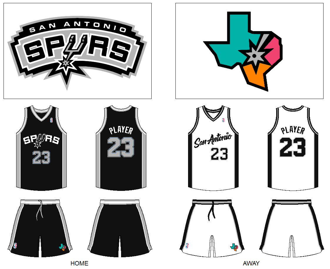
Not a fan of the color vs color and no clear designation on what home and road teams wear. My solution is color at home (home team would want to wear their team colors for the fans), with white on the road. Much like with baseball, there would be the nickname on the home jersey, and city name on the road jersey. 
For realignment, I would do 4 divisions with 8 teams, and no conference alignment, eliminating the often complained about problems lately where the west was dominant and the NBA Finals felt like and afterthought to the conference finals. 
Click on any image to see the full size.

Atlantic Division:

Boston Celtics:
Going with a simple and traditional look for one of the NBA's most historic and prominent teams.


Brooklyn Nets:
I like the simplicity in their design and color scheme. However the complete lack of any color is a bit too over the top for me, and too simple just to be simple. So adding in some gold accents. 


Miami Heat:
When I think of Miami and I think of heat, warm colors like orange and pink come to mind. So switching from black to pink as the primary color. I think it is more vibrant for a place like Miami, you don't have a major US team using pink as the primary color. Given the popularity of pink in their vice alternates clearly the fans there will embrace the color. 


New York Knicks
Not much to change here, just giving them a Knicks wordmark at home, and bringing back the NY apple logo.


Orlando Magic:
Bringing back the original pinstripe design but using the modern logo and font.


Philadelphia 76ers:
Much of their current uniform works, but switching to red, their original main color and associated with their Barkley era days, as well as standing out from traditional blue teams like New York and Detroit.


Toronto Huskies:
If there are no Minnesota Timberwolves, that means Toronto would have brought back the Huskies name. Since they said they couldn't go Huskies without looking like the Wolves logo, I just recolored that logo. Rather than their original blue, or the Raptors purple, going with an Indigo color, that matches well with gray and black. 


Washington Bullets:
I don't dislike the Wizards name, but it is too similar to the Magic, plus I never thought they should have gotten rid of the Bullets name to begin with. That said, a lot of their current look and logos work, so keep much of that with the Bullets name.


Southern Division:

Atlanta Hawks:
They have always been a red and yellow team in my mind, so applying those colors and the current logos to something similar to their early 1970s side stripe design. Has a good retro vibe that works.


Charlotte Hornets:
Going back to the original design of the hornet logo, though it is the slight modernization from when they went to New Orleans. As far as uniforms, something modern but simple, the color scheme does enough of the work to keep them unique looking.


Dallas Mavericks:
I really prefer their old cowboy hat era days. Bringing it back to those bright blue and green colors, with a very traditional design.


Houston Rockets:
Their current logo and design just looks like a bad template for reebok apparel or something. Modifying their 90s era rocket into a logo reminiscent of the San Diego Rockets logo. Their championship era wordmark logos come back, as well as a pant stripe design evoking the thrust from a rocket. Also switch from a more traditional red to crimson and gray. 


Memphis Kings:
The Kings name just fits here, between MLK Jr. and Elvis, seems far more appropriate here than Grizzlies, likewise given the grizzly bear is the state animal in California, a nickname swap just makes sense. If you are going with Kings the royal purple and gold are an obvious fit.


New Orleans Jazz:
This is just a given. Return the Jazz to New Orleans. They can use the original logo which still holds up, and their NOLA alternate from when the Hornets were in town. Obviously the mardi gras color theme works well for them. 


Oklahoma City Thunder:
Needless to say their current logo is the worst in sports, and the color scheme just feels like a rip off of New York. I love the logos by Brand Moore Art and Jai Black, so I tweaked the color scheme by going to yellow and black. Not really associated with NBA team but a great color combo, and makes sense for a team called the thunder, be it yellow lightning or black storm clouds.


San Antonio Spurs:
A really simple look for an organization that has, aside from some crazy alternate designs, been fairly simple and classy. Bringing back the old fiesta colors for the secondary logo.


Central Division:

Chicago Bulls:
Classic design, nothing to change here.


Cleveland Cavaliers:
Going back to orange and blue for the Cavs, and since they want to keep black due their the championship in it, then it make sense to use the orange, light blue, and black color scheme from the 90s. But instead of that wild design and lackluster logo, using the logos from their championship season. 


Detroit Pistons:
Going back to their original logo is okay and all, but it is so generic, so it is better as a secondary logo. Their '90s era logo is out there, but with some recoloring to their traditional red and blue scheme, with some chrome in there, works well and just a good visual for the piston horsepower concept. Blue uniforms with red side panels are their staple.


Indiana Pacers:
An update of the Reggie Miller era uniforms here. That Knicks/Pacers rivalry was one of the best parts of the NBA, makes sense to evoke it here.


Kentucky Colonels:
The old ABA franchise returns. A darker blue and light orange rather than red in for the team colors. Keeping the dog around as a secondary logo also.


Milwaukee Bucks:
Keeping most of their current design in place. A good look for them, but using various shades of green as their color set.


Minneapolis Lakers:
It is a shame they lost both the Lakers and North Stars, because those we great names perfect for the area, much like the Twins and Vikings. Baby blue and yellow is a great combo, going with a lot of the current Lakers design elements here, and modifying the Lakers minor league team logo for the primary.


Spirits of St Louis:
Just a classic identity for this team that was sadly lost when the ABA folded. Bringing back the burnt orange uniforms with a little silver accenting. 


Western Division:


Denver Nuggets:
I like their recent rebrand, I would say I identify them as a navy team with gold and red from their 1990s design, but that the mountains logo on the jersey is their signature look. Trying to combine both here.


Los Angeles Clippers:
Their last rebrand was such an epic disaster, LA Clip Art is what it makes you think. Resurrecting and modifying some of their past logos with an updated color scheme of red and baby blue, with navy accents. The old script works well, and by changing from overused blue and red, to a more unique color scheme it actually looks like a nice uniform. 


Phoenix Suns:
If you are talking the sun and the city of Phoenix orange definitely comes to mind as a primary color. Updated the primary logo and based the uniforms on the popular 1990s design.


Portland Trailblazers:
Using the original font and uniform design with a modern update of the logo.


Sacramento Grizzlies:
Bringing back the original Grizzlies logos, but going with a brown, gold, and red color scheme, fitting with the state flag in California. Brown isn't represented in the NBA, it fits with the team and makes them stand out. 


San Francisco Warriors:
Moving across the bay to a new arena soon, going by the name Golden State always seemed weird to me. Also not particularly a fan of the logo on the jersey, I actually prefer something similar to the Chris Mullin look of the 1990s, but splitting the difference and keeping the front jersey numbers in a more understated circle.


Seattle Supersonics:
With only one team in LA now there is room to bring the Sonics back to Seattle. A modified version of their last look prior to relocation works. Also a modified version of their original space needle logo as a secondary logo.


Utah Raptors:
If anyone would be the Raptors, it makes sense for Utah since their is a dinosaur named for the state. There is just something classic about the original Raptors logo. Recoloring it, with a red-orange as their primary color, a nod to the red rocks. Red and tealish green make a good combo, and since the Raptors name is very 90s, might as go with one of the 90s colors.